节点用户界面元素#
n8n 提供了一组预定义的 UI 组件(基于 JSON 文件),允许用户输入各种数据类型。n8n 中提供以下 UI 元素。
String#
基本配置:
{
	displayName: Name, // The value the user sees in the UI
	name: name, // The name used to reference the element UI within the code
	type: string,
	required: true, // Whether the field is required or not
	default: 'n8n',
	description: 'The name of the user',
	displayOptions: { // the resources and operations to display this element with
		show: {
			resource: [
				// comma-separated list of resource names
			],
			operation: [
				// comma-separated list of operation names
			]
		}
	},
}

用于输入密码的字符串字段:
{
	displayName: 'Password',
	name: 'password',
	type: 'string',
	required: true,
	typeOptions: {
		password: true,
	},
	default: '',
	description: `User's password`,
	displayOptions: { // the resources and operations to display this element with
		show: {
			resource: [
				// comma-separated list of resource names
			],
			operation: [
				// comma-separated list of operation names
			]
		}
	},
}

具有多行的字符串字段:
{
	displayName: 'Description',
	name: 'description',
	type: 'string',
	required: true,
	typeOptions: {
		rows: 4,
	},
	default: '',
	description: 'Description',
	displayOptions: { // the resources and operations to display this element with
		show: {
			resource: [
				// comma-separated list of resource names
			],
			operation: [
				// comma-separated list of operation names
			]
		}
	},
}

支持数据键的拖放#
用户可以拖放数据值以将它们映射到字段。拖放会创建一个表达式来加载数据值。n8n 自动支持此功能。
你需要添加一个额外的配置选项来支持拖放数据键:
requiresDataPath: 'single':用于需要单个字符串的字段。requiresDataPath: 'multiple':用于可以接受逗号分隔的字符串列表的字段。
Number#
带小数点的数字字段:
{
	displayName: 'Amount',
	name: 'amount',
	type: 'number',
	required: true,
	typeOptions: {
		maxValue: 10,
		minValue: 0,
		numberPrecision: 2,
	},
	default: 10.00,
	description: 'Your current amount',
	displayOptions: { // the resources and operations to display this element with
		show: {
			resource: [
				// comma-separated list of resource names
			],
			operation: [
				// comma-separated list of operation names
			]
		}
	},
}

Collection#
当你需要显示可选字段时,使用 collection 类型。
{
	displayName: 'Filters',
	name: 'filters',
	type: 'collection',
	placeholder: 'Add Field',
	default: {},
	options: [
		{
			displayName: 'Type',
			name: 'type',
			type: 'options',
			options: [
				{
					name: 'Automated',
					value: 'automated',
				},
				{
					name: 'Past',
					value: 'past',
				},
				{
					name: 'Upcoming',
					value: 'upcoming',
				},
			],
			default: '',
		},
	],
	displayOptions: { // the resources and operations to display this element with
		show: {
			resource: [
				// comma-separated list of resource names
			],
			operation: [
				// comma-separated list of operation names
			]
		}
	},
}

DateTime#
dateTime 类型提供日期选择器。
{
	displayName: 'Modified Since',
	name: 'modified_since',
	type: 'dateTime',
	default: '',
	description: 'The date and time when the file was last modified',
	displayOptions: { // the resources and operations to display this element with
		show: {
			resource: [
				// comma-separated list of resource names
			],
			operation: [
				// comma-separated list of operation names
			]
		}
	},
}

Boolean#
boolean 类型添加一个用于输入 true 或 false 的切换开关。
{
	displayName: 'Wait for Image',
	name: 'waitForImage',
	type: 'boolean',
	default: true, // Initial state of the toggle
	description: 'Whether to wait for the image or not',
	displayOptions: { // the resources and operations to display this element with
		show: {
			resource: [
				// comma-separated list of resource names
			],
			operation: [
				// comma-separated list of operation names
			]
		}
	},
}

Color#
color 类型提供颜色选择器。
{
	displayName: 'Background Color',
	name: 'backgroundColor',
	type: 'color',
	default: '', // Initially selected color
	displayOptions: { // the resources and operations to display this element with
		show: {
			resource: [
				// comma-separated list of resource names
			],
			operation: [
				// comma-separated list of operation names
			]
		}
	},
}

Options#
options 类型添加选项列表。用户可以选择单个值。
{
	displayName: 'Resource',
	name: 'resource',
	type: 'options',
	options: [
		{
			name: 'Image',
			value: 'image',
		},
		{
			name: 'Template',
			value: 'template',
		},
	],
	default: 'image', // The initially selected option
	description: 'Resource to consume',
	displayOptions: { // the resources and operations to display this element with
		show: {
			resource: [
				// comma-separated list of resource names
			],
			operation: [
				// comma-separated list of operation names
			]
		}
	},
}

Multi-options#
multiOptions 类型添加选项列表。用户可以选择多个值。
{
	displayName: 'Events',
	name: 'events',
	type: 'multiOptions',
	options: [
		{
			name: 'Plan Created',
			value: 'planCreated',
		},
		{
			name: 'Plan Deleted',
			value: 'planDeleted',
		},
	],
	default: [], // Initially selected options
	description: 'The events to be monitored',
	displayOptions: { // the resources and operations to display this element with
		show: {
			resource: [
				// comma-separated list of resource names
			],
			operation: [
				// comma-separated list of operation names
			]
		}
	},
}

Filter#
使用此组件来评估、匹配或过滤传入数据。
这是来自 n8n 自己的 If 节点的代码。它展示了一个与 collection 组件一起工作的过滤器组件,用户可以在其中配置过滤器的行为。
{
	displayName: 'Conditions',
	name: 'conditions',
	placeholder: 'Add Condition',
	type: 'filter',
	default: {},
	typeOptions: {
		filter: {
			// Use the user options (below) to determine filter behavior
			caseSensitive: '={{!$parameter.options.ignoreCase}}',
			typeValidation: '={{$parameter.options.looseTypeValidation ? "loose" : "strict"}}',
		},
	},
},
{
displayName: 'Options',
name: 'options',
type: 'collection',
placeholder: 'Add option',
default: {},
options: [
	{
		displayName: 'Ignore Case',
		description: 'Whether to ignore letter case when evaluating conditions',
		name: 'ignoreCase',
		type: 'boolean',
		default: true,
	},
	{
		displayName: 'Less Strict Type Validation',
		description: 'Whether to try casting value types based on the selected operator',
		name: 'looseTypeValidation',
		type: 'boolean',
		default: true,
	},
],
},

Assignment collection(拖放)#
当你希望用户通过单次拖动交互预填充名称和值参数时,使用拖放组件。
{
	displayName: 'Fields to Set',
	name: 'assignments',
	type: 'assignmentCollection',
	default: {},
},
你可以在 n8n 的 Edit Fields (Set) 节点中看到一个示例:

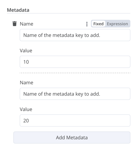
Fixed collection#
使用 fixedCollection 类型对语义相关的字段进行分组。
{
	displayName: 'Metadata',
	name: 'metadataUi',
	placeholder: 'Add Metadata',
	type: 'fixedCollection',
	default: '',
	typeOptions: {
		multipleValues: true,
	},
	description: '',
	options: [
		{
			name: 'metadataValues',
			displayName: 'Metadata',
			values: [
				{
					displayName: 'Name',
					name: 'name',
					type: 'string',
					default: 'Name of the metadata key to add.',
				},
				{
					displayName: 'Value',
					name: 'value',
					type: 'string',
					default: '',
					description: 'Value to set for the metadata key.',
				},
			],
		},
	],
	displayOptions: { // the resources and operations to display this element with
		show: {
			resource: [
				// comma-separated list of resource names
			],
			operation: [
				// comma-separated list of operation names
			]
		}
	},
}
Resource locator#

资源定位器元素帮助用户在外部服务中查找特定资源,例如 Trello 中的卡片或标签。
可用选项如下:
- ID
- URL
- 列表:允许用户从预填充列表中选择或搜索。此选项需要更多编码,因为你必须填充列表,并在选择支持搜索时处理搜索。
你可以选择要包含的类型。
示例:
{
	displayName: 'Card',
	name: 'cardID',
	type: 'resourceLocator',
	default: '',
	description: 'Get a card',
	modes: [
		{
			displayName: 'ID',
			name: 'id',
			type: 'string',
			hint: 'Enter an ID',
			validation: [
				{
					type: 'regex',
					properties: {
						regex: '^[0-9]',
						errorMessage: 'The ID must start with a number',
					},
				},
			],
			placeholder: '12example',
			// How to use the ID in API call
			url: '=http://api-base-url.com/?id={{$value}}',
		},
		{
			displayName: 'URL',
			name: 'url',
			type: 'string',
			hint: 'Enter a URL',
			validation: [
				{
					type: 'regex',
					properties: {
						regex: '^http',
						errorMessage: 'Invalid URL',
					},
				},
			],
			placeholder: 'https://example.com/card/12example/',
			// How to get the ID from the URL
			extractValue: {
				type: 'regex',
				regex: 'example.com/card/([0-9]*.*)/',
			},
		},
		{
			displayName: 'List',
			name: 'list',
			type: 'list',
			typeOptions: {
				// You must always provide a search method
				// Write this method within the methods object in your base file
				// The method must populate the list, and handle searching if searchable: true
				searchListMethod: 'searchMethod',
				// If you want users to be able to search the list
				searchable: true,
				// Set to true if you want to force users to search
				// When true, users can't browse the list
				// Or false if users can browse a list
				searchFilterRequired: true,
			},
		},
	],
	displayOptions: {
		// the resources and operations to display this element with
		show: {
			resource: [
				// comma-separated list of resource names
			],
			operation: [
				// comma-separated list of operation names
			],
		},
	},
},
有关实际示例,请参阅以下内容:
- 参考 n8n 的 Trello 节点中的
CardDescription.ts和Trello.node.ts,了解包含searchFilterRequired: true的带搜索列表的示例。 - 参考
GoogleDrive.node.ts,了解用户可以浏览列表或搜索的示例。
Resource mapper#
如果你的节点执行插入、更新或 upsert 操作,你需要以你正在集成的服务支持的格式从节点发送数据。一个常见的模式是在发送数据的节点之前使用 Set 节点,将数据转换为与你连接的服务的架构匹配。资源映射器 UI 组件提供了一种直接在节点内将数据转换为所需格式的方法,而不是使用 Set 节点。资源映射器组件还可以根据节点中提供的架构验证输入数据,并将输入数据转换为预期类型。
映射和匹配
映射是设置输入数据以在更新行时用作值的过程。匹配是使用列名来标识要更新的行的过程。
{
	displayName: 'Columns',
	name: 'columns', // The name used to reference the element UI within the code
	type: 'resourceMapper', // The UI element type
	default: {
		// mappingMode can be defined in the component (mappingMode: 'defineBelow')
		// or you can attempt automatic mapping (mappingMode: 'autoMapInputData')
		mappingMode: 'defineBelow',
		// Important: always set default value to null
		value: null,
	},
	required: true,
	// See "Resource mapper type options interface" below for the full typeOptions specification
	typeOptions: {
		resourceMapper: {
			resourceMapperMethod: 'getMappingColumns',
			mode: 'update',
			fieldWords: {
				singular: 'column',
				plural: 'columns',
			},
			addAllFields: true,
			multiKeyMatch: true,
			supportAutoMap: true,
			matchingFieldsLabels: {
				title: 'Custom matching columns title',
				description: 'Help text for custom matching columns',
				hint: 'Below-field hint for custom matching columns',
			},
		},
	},
},
参考 Postgres 节点(版本 2),了解使用数据库架构的实际示例。
参考 Google Sheets 节点(版本 2),了解使用无架构服务的实际示例。
Resource mapper 类型选项接口#
typeOptions 部分必须实现以下接口:
export interface ResourceMapperTypeOptions {
	// The name of the method where you fetch the schema
	// Refer to the Resource mapper method section for more detail
	resourceMapperMethod: string;
	// Choose the mode for your operation
	// Supported modes: add, update, upsert
	mode: 'add' | 'update' | 'upsert';
	// Specify labels for fields in the UI
	fieldWords?: { singular: string; plural: string };
	// Whether n8n should display a UI input for every field when node first added to workflow
	// Default is true
	addAllFields?: boolean;
	// Specify a message to show if no fields are fetched from the service
	// (the call is successful but the response is empty)
	noFieldsError?: string;
	// Whether to support multi-key column matching
	// multiKeyMatch is for update and upsert only
	// Default is false
	// If true, the node displays a multi-select dropdown for the matching column selector
	multiKeyMatch?: boolean;
	// Whether to support automatic mapping
	// If false, n8n hides the mapping mode selector field and sets mappingMode to defineBelow
	supportAutoMap?: boolean;
	// Custom labels for the matching columns selector
	matchingFieldsLabels?: {
		title?: string;
		description?: string;
		hint?: string;
	};
}
Resource mapper 方法#
此方法包含用于获取数据架构的节点特定逻辑。每个节点都必须实现自己的逻辑来获取架构,并根据架构设置每个 UI 字段。
它必须返回一个实现 ResourceMapperFields 接口的值:
interface ResourceMapperField {
	// Field ID as in the service
	id: string;
	// Field label
	displayName: string;
	// Whether n8n should pre-select the field as a matching field
	// A matching field is a column used to identify the rows to modify
	defaultMatch: boolean;
	// Whether the field can be used as a matching field
	canBeUsedToMatch?: boolean;
	// Whether the field is required by the schema
	required: boolean;
	// Whether to display the field in the UI
	// If false, can't be used for matching or mapping
	display: boolean;
	// The data type for the field
	// These correspond to UI element types
	// Supported types: string, number, dateTime, boolean, time, array, object, options
	type?: FieldType;
	// Added at runtime if the field is removed from mapping by the user
	removed?: boolean;
	// Specify options for enumerated types
	options?: INodePropertyOptions[];
}
参考 Postgres 资源映射方法和 Google Sheets 资源映射方法,了解实际示例。
JSON#
{
	displayName: 'Content (JSON)',
	name: 'content',
	type: 'json',
	default: '',
	description: '',
	displayOptions: { // the resources and operations to display this element with
		show: {
			resource: [
				// comma-separated list of resource names
			],
			operation: [
				// comma-separated list of operation names
			]
		}
	},
}

HTML#
HTML 编辑器允许用户在其工作流中创建 HTML 模板。编辑器支持标准 HTML、<style> 标签中的 CSS 以及包装在 {{}} 中的表达式。用户可以添加 <script> 标签来引入额外的 JavaScript。n8n 在工作流执行期间不会运行此 JavaScript。
{
	displayName: 'HTML Template', // The value the user sees in the UI
	name: 'html', // The name used to reference the element UI within the code
	type: 'string',
	typeOptions: {
		editor: 'htmlEditor',
	},
	default: placeholder, // Loads n8n's placeholder HTML template
	noDataExpression: true, // Prevent using an expression for the field
	description: 'HTML template to render',
},
参考 Html.node.ts,了解实际示例。
Notice#
��显示带有提示或额外信息的黄色框。有关编写良好提示和信息文本的指导,请参阅节点 UI 设计。
{
  displayName: 'Your text here',
  name: 'notice',
  type: 'notice',
  default: '',
},

Hints#
有两种类型的提示:参数提示和节点提示:
- 参数提示是用户输入字段下方的小文本行。
- 节点提示是比 Notice 更强大和灵活的选项。使用它们在输入面板、输出面板或节点详细信息视图中显示更长的提示。
添加参数提示#
将 hint 参数添加到 UI 元素:
{
	displayName: 'URL',
	name: 'url',
	type: 'string',
	hint: 'Enter a URL',
	...
}
添加节点提示#
在节点 description 中的 hints 属性中定义节点的提示:
description: INodeTypeDescription = {
	...
	hints: [
		{
			// The hint message. You can use HTML.
			message: "This node has many input items. Consider enabling <b>Execute Once</b> in the node\'s settings.",
			// Choose from: info, warning, danger. The default is 'info'.
			// Changes the color. info (grey), warning (yellow), danger (red)
			type: 'info',
			// Choose from: inputPane, outputPane, ndv. By default n8n displays the hint in both the input and output panels.
			location: 'outputPane',
			// Choose from: always, beforeExecution, afterExecution. The default is 'always'
			whenToDisplay: 'beforeExecution',
			// Optional. An expression. If it resolves to true, n8n displays the message. Defaults to true.
			displayCondition: '={{ $parameter["operation"] === "select" && $input.all().length > 1 }}'
		}
	]
	...
}
向编程式节点添加动态提示#
在编程式节点中,你可以创建包含节点执行信息的动态消息。由于它依赖于节点输出数据,因此在执行后才能显示此类型的提示。
if (operation === 'select' && items.length > 1 && !node.executeOnce) {
    // Expects two parameters: NodeExecutionData and an array of hints
	return new NodeExecutionOutput(
		[returnData],
		[
			{
				message: `This node ran ${items.length} times, once for each input item. To run for the first item only, enable <b>Execute once</b> in the node settings.`,
				location: 'outputPane',
			},
		],
	);
}
return [returnData];
有关编程式节点中动态提示的实际示例,请查看 Split Out 节点代码。